5 tips for creating a professional header
- FTMgraphics
- Sep 7, 2019
- 3 min read

The header of your mails is what will "dress" them. You wouldn't show up for a business meeting in the simplest device, would you? In the same way, the dresses of which you will put your professional letters will be essential.
These tips will help you to better match your letters.
1. Dress your mail up and down

In a letter, you will have the body of the message, in the middle, but also the header and possibly the footer.
All these areas must be clearly identifiable at first glance.
Out of the question to see a foot, with for example the address of your seat, to stick to the signature, without distinction, to the point of resembling a postscript.
Respect the different areas and mark their separation, with sufficient white space, a line, or color choices.
2. Go til the borders
Think of the outer edges of your page as a frame, and put some color on it.
Visually, this attracts the eye of the recipient: your mail will not get lost in the mass of mail received, it will immediately stand out.

This technique assumes of course a color impression: a black frame would evoke too much invitations far less pleasant to receive.
On the other hand, all the techniques of color are usable, from the simple monochrome border to the gradients, passing by the reasons.
3. Review your geometry in opposite angles

For a simple but elegant design, you can always count on geometric shapes.
Calculate how you can insert them in a higher angle and a lower corner of your mail without losing too much space on the body of the letter.
A symmetrical effect would be here unwelcome: you will have to compare the advantages of opting for a larger format design at the top or bottom of the page.

You will notice that this technique, which adds a little life and dynamism to the dullest mail, can also be declined:
with touches of watercolor or any other pattern that suits your taste,
to the trend of the moment,
to your graphic charter ...
The goal is to show that you have invested in the preparation of your mail.
4. Take up space

Nothing forces you to be shy when you set your header.
Yes, a simple logo with your name and contact information may be sufficient. But why not spread out, use the full width of the page with a header that really stands out?

Think of it as the header of a web page.
> You have all this space to express yourself, so use it.
> As for the height of your ambitions, do not limit it too much.
> the body of the message must occupy most of the page.
> But you are not forced to limit yourself to one or two lines to remember who you are.
> To occupy more space will also show that you have confidence in yourself...
And will help you share that trust with the recipients of your messages.
5. Decline your stationery line

It is often a question of graphic identity. And it is also expressed by your letters.
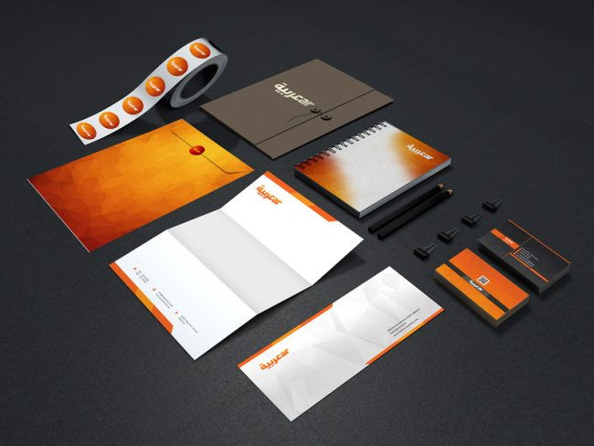
Be careful, this is more of a question than the header of your mail. The envelopes in which you send them will also help you stand out. Ideally, all your business communication should display the same colors and effects, from the business card to your mail.
The minimum could be to print your logos on envelopes, but these can also be decorated with the same illustrations as your headers.
Show your sense of detail in the presentation of your professional mail!
Comments